“I’m always trying to get back to the 20s a little bit.”
—John Dickerson, in Field Notes interview (2016) 

Perhaps lamenting too much technology, Dickerson says he’s got two screens on the computer in his office as well as an iPad and a phone. But he’s also got “a notebook [that] does only one thing”. He’s also got an old black lacquer Underwood standard typewriter (No. 4, 5, or 6?) on his office desk. Typewriters only do one thing too.

Wonder if he still uses it? 

A Book Club Reading of A System for Writing by Bob Doto

Dan Allosso’s (Obsidisan) Book Club will be reading Bob Doto‘s book A System for Writing (2024) as their next selection. Discussion meetings are via Zoom for 2 hours on Saturdays starting on 2024-10-19 to 11-02 from 8:00 AM – 10:00 AM Pacific.  New comers and veterans are all welcome to attend.

The book is broken up into 3 parts (approximately 50-75 pages each) and we’ll discuss each on succeeding weeks. The group has several inveterate note takers who are well-acquainted with Zettelkasten methods. 

If you’d like access to the Obsidian vault, please email danallosso at icloud dot com with your preferred email address to connect to the Dropbox repository.

DM either Dan or myself for the Zoom link for the video meetings.

Dark blue book cover of Bob Doto's A System of Writing featuring a network-like snowflake image.

Miles (1905) has some interesting things to say with respect to collecting, “business-like brevity” (aka atomic notes), annotations for thinking/arranging/marking cards, summarizing, etc.

Miles, Eustace Hamilton. How to Prepare Essays, Lectures, Articles, Books, Speeches and Letters, with Hints on Writing for the Press. London: Rivingtons, 1905. http://archive.org/details/howtoprepareessa00mileuoft.

Especially interesting: Chapter XXIV The Card-System.

Paul Conkin’s Zettelkasten Advice

In the second lecture of David Blight’s Devane Lecture Series 2024 entitled “Can It Happen Here Again? Yale, Slavery, the Civil War and Their Legacies”, he makes a passing mention of historian, professor, and prolific writer Paul Conkin’s office desk and side tables being covered in index cards full of notes. Further, he says that Conkin admonished students that for every hour they spend reading, they should spend an hour in reflection. The comment is followed by a mention that no one does this with the implication that information overload and the pressures of time don’t allow this.

Of course those with a card index or zettelkasten-based reading and note making practice will realize that they’re probably automatically following the advice of this towering figure of American intellectual history as a dint of their note making system.

Listened to The Informed Life: Episode 139 Chris Aldrich on Cybernetic Communications by Jorge ArangoJorge Arango from The Informed Life

Chris Aldrich has the most multi-disciplinary resume I’ve ever seen, with a background that includes biomedics, electrical engineering, entertainment, genetics, theoretical mathematics, and more. Chris describes himself as a modern-day cybernetician, and in this conversation we discuss cybernetics and communications, differences between oral and literary cultures, and indigenous traditions and mnemonics, among many other things.

Show notes and audio transcript available at The Informed Life: Episode 139

A while back, I recorded an episode of The Informed Life with Jorge Arango, and it’s just been released. We had hoped to cover a couple of specific topics, but just as we hit record, our topic agenda took a left turn into some of my recent interests in intellectual history.

Jorge has a great little show which he’s been doing for quite a while. If you’re not already subscribed, take a moment to see what he’s offering in the broad space of tools for thought. I’ve been a long time subscriber and was happy to chat with Jorge directly.

Knowledge management practices on romantic display in George Eliot’s Middlemarch

Given that George Eliot had her own commonplace book, it’s fascinating but not surprising to see a section of prose about note taking and indexing practices in Middlemarch (set in 1829 to 1832 and published in 1871-1872) literally as the romance story is just beginning to brew. [Naturally a romance with index cards at its heart is just my cup of tea, n’cest pas?] Presently it’s not surprising to see the romance of an independent thinking woman stem out of an intellectual practice (dominated heavily by men at the time) that was fairly common in its day, but for it’s time such an incongruous juxtaposition may have been jarring to some readers.

In chapter two Mr. Brooke, the uncle, asks for advice about arranging notes as he has tried pigeon holes as a method but has the common issue of multiple storage and can’t remember under which letter he’s filed his particular note. [At the time, many academics would employ secretarial staff to copy their note cards multiple times so that a note that needed to be classified under “hope” and “liberty”, as an example, could be filed under both. Individuals working privately without the support of an amanuensis or additional indexing techniques would have had more difficulty with filing material in the same manner Mr Brooke did. Digital note takers using platforms like Obsidian or Logseq don’t have to worry about such issues now.]

Mr. Casaubon indicates that he uses pigeon-holes which was a popular method of filing, particularly in Britain where John Murray and the editors of the Oxford English Dictionary were using a similar method to build their dictionary at the time.

Our heroine Dorothea Brooke mentions that she knows how to properly index papers so that they might be searched for and found later. She is likely aware of John Locke’s indexing method from 1685 (or in English in 1706) and in the same passage—and almost the same breath—compares Mr. Casaubon’s appearance favorably to that of Locke as “one of the most distinguished-looking men I ever saw.”

In some sense here, we should be reading the budding romance, not just as one based on beautiful appearance or one’s station or even class, but one of intellectual stature and equality. One wants a mate not only as distinguished and handsome as Locke, but one with the beauty of mind as well. Without the subtextual understanding of knowledge management during this time period, this crucial component of the romance would be missed though Eliot later hints at it by many other means. Still, in the opening blushes of love, it is there on prominent display.

For those without their copies close at hand, here’s the excerpted passage:

“I made a great study of theology at one time,” said Mr Brooke, as if to explain the insight just manifested. “I know something of all schools. I knew Wilberforce in his best days. Do you know Wilberforce?
“Mr Casaubon said, “No.”
“Well, Wilberforce was perhaps not enough of a thinker; but if I went into Parliament, as I have been asked to do, I should sit on the independent bench, as Wilberforce did, and work at philanthropy.”
Mr Casaubon bowed, and observed that it was a wide field.
“Yes,” said Mr Brooke, with an easy smile, “but I have documents. I began a long while ago to collect documents. They want arranging, but when a question has struck me, I have written to somebody and got an answer. I have documents at my back. But now, how do you arrange your documents?”
“In pigeon-holes partly,” said Mr Casaubon, with rather a startled air of effort.
“Ah, pigeon-holes will not do. I have tried pigeon-holes, but everything getsmixed in pigeon-holes: I never know whether a paper is in A or Z.”
“I wish you would let me sort your papers for you, uncle,” said Dorothea. “I would letter them all, and then make a list of subjects under each letter.
“Mr Casaubon gravely smiled approval, and said to Mr Brooke, “You have an excellent secretary at hand, you perceive.”
“No, no,” said Mr Brooke, shaking his head; “I cannot let young ladies meddle with my documents. Young ladies are too flighty.
“Dorothea felt hurt. Mr Casaubon would think that her uncle had some special reason for delivering this opinion, whereas the remark lay in his mind as lightly as the broken wing of an insect among all the other fragments there, and a chance current had sent it alighting on her.
When the two girls were in the drawing-room alone, Celia said—
“How very ugly Mr Casaubon is!”
“Celia! He is one of the most distinguished-looking men I ever saw. He is remarkably like the portrait of Locke. He has the same deep eye-sockets.”

—George Eliot in Middlemarch (Norton Critical Edition, 2nd edition, Bert G. Hornback ed., 2000), Book I, Chapter 2, p13.

Acquisition: Remington Streamliner 196X Portable Typewriter in Metallic Mint Blue

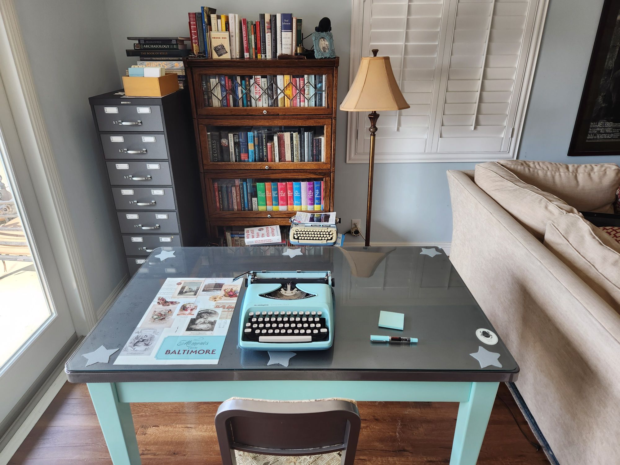
On March 11, 2023, I’d gotten a nice deal on a Remington Streamline portable typewriter in a generally uncontested online auction. I was certainly taking a small chance on a typewriter only by a few photos and the label “untested”, but I couldn’t resist the mint blue color which seemed like it would be a close match to my TWSBI Eco T fountain pen and my custom General Fireproofing 20 gauge steel desk

Yesterday, the typewriter arrived, and today I took a short break to open it up and give it a short test drive. In addition to the fantastic news that the machine is in stunning shape, its color is about as perfect a match to the pen and the desk as one could ask!

Close up of the Remington Streamliner logo in black and red on the typewriter's hood on which sits a matching mint blue TWSBI Eco T fountain pen with red ink.

View of a working desk area featuring a silver/glass topped mint blue desk on which sits a matching colored portable typewriter, a fountain pen and a stack of Post-it notes. In the background is a card index filing cabinet and a barrister bookcase full of books.

Overall

The overall condition was beyond my dreams for this vintage and with some plastic portions. The typewriter only has a few signs of use and wear with some paint worn off at the corners of the back and on the right hand side where the platen knob meets the body. A bit of the “R” on the top Remington logo is worn off and seems to be thermally printed on, so I wouldn’t recommend heavy scrubbing, harsh abrasives, or caustic chemicals when cleaning the bodies of these for fear of removing the logo all together. These small flaws gives the machine some nice patina and the street cred of some reasonable use as a portable. There’s some small wear to the plastic hood where the two position return lever has rubbed against it. Otherwise it is in about as good a condition as one could hope. 

All the keys worked with some severe stickiness on the “L” key. The smallest of tweaks on the head of the typebar remedied the issue without resorting to cleaning. The margin release wasn’t operating properly, but only because an obvious and easily re-mounted tension wire had become unhooked.

There is some minor grime and dust inside the body which could stand some cleaning, but it’s in great shape right out of the box. I’ll try to spend some time blowing it out and cleaning it up internally while I await some replacement ribbon.

The typewriter itself is has a metal chassis which is permanently screwed into a slightly darker plastic green base. This base dovetails with the plastic lid to create a case with a rubber-like plastic handle. Sadly the lid of the case was badly cracked and splintered into a dozen or so pieces in shipping, so I’m going to consider the lid a total loss. I’ll have to fashion some type of cover to keep the dust (and more importantly the German shepherd fur) out of the internal mechanisms.

On this model, the serial number is imprinted on to the black metal bottom chassis between the “U” and “J” keys when looking down at the typewriter from above. The serial number on my particular machine is AX 16 74 89. Sadly, the Typewriter Database doesn’t have serial numbers for this model or the late 60s or early 70s timespan in which these were made. One model in the database is dated to 1969 with a serial number starting with CX so it’s possible mine may be as early as ’68 or ’69 but sadly without better data, one can’t be sure.

Richard Polt has a Remington Streamliner manual for the 60s available, and though it’s close in broad look and functionality, it’s obviously not for this specific model or year.

Given the time period and the metallic mint paint, I do sort of wish this model also had Positraction, but then I suppose it would have needed to be produced by GM rather than Remington.
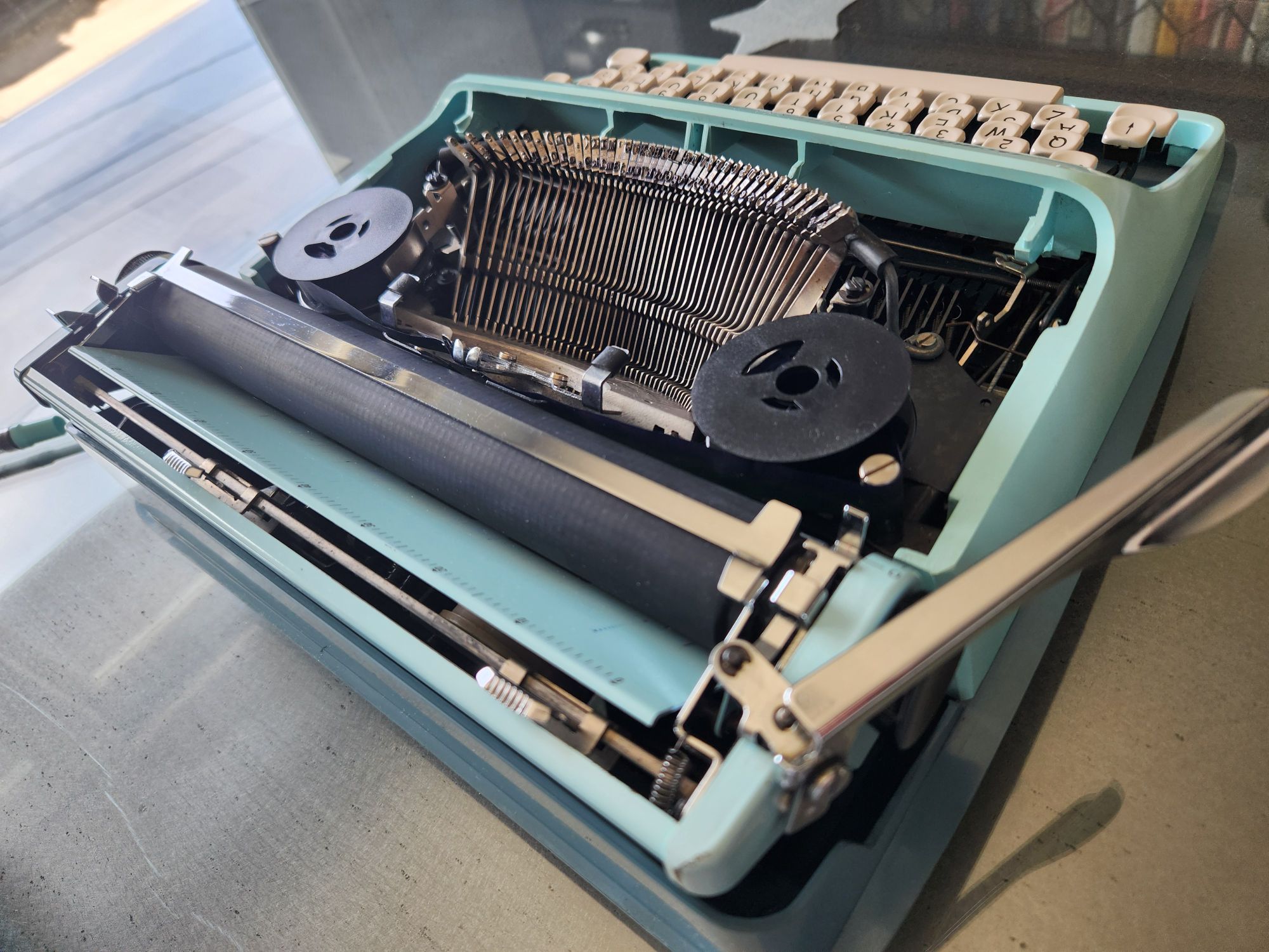
Angled view from the right hand side and behind of the Remington Streamliner typewriter with the hood removed to provide a view of the typebasket, typebars, ribbon spools and the platen.

Keys

The keys appear to be thin beige pieces of almost bone-like plastic floating in mid-air but have thicker plastic and metal bases which give them a nice action. There’s a standard back space (curved arrow on the left), a margin release (double arrow on the right), but surprisingly for the age, is missing a dedicated 1/! key. There is no built-in tab functionality.

Close up of the cream colored keys of the Remington Streamliner keyboard

Ribbon

The machine has the typical larger Remington ribbon cores and this one included a dead, improperly seated ribbon on original metal rings. I swapped these out briefly for a new ribbon, though the plastic hub doesn’t seat as tightly as one would wish for the ribbon advance to work properly. I’ll get some new ribbon and handspool it onto the original cores and we should be off to the races. I’ll note that no metal ribbon covers, which had been standard on earlier models of this make, were present, though its probably just as likely that these were never included on their later models either for weight, functionality, or manufacturing cost reasons.

I’m don’t see any switch or button for the spool reverse, but suspect that the built-in mechanical sensors will operate as expected for Remingtons of this era. If not, it’s easy enough to actuate the switch manually with the hood off.

Also not available on this model is a switch for using two colored ribbons, so I’ll just have to be satisfied with a single color. 

Overhead view from behind of Remington Streamliner typewriter with the hood removed to allow a view into the typebasket featuring all the typebars and pica typeface as well as two plastic ribbon spools.

Other Functionality

 As a later portable, the machine is missing some of the additional niceties of heavier late 50s or early 60s desk models. It does have a “card finger”, though only on the left. The return arm has two positions and a simple friction fit operation—one for use and the other for storage.

The machine has a carriage shift rather than a basket shift. The platen knobs are rather on the small side, and don’t have a typical button for variable line spacing. This line spacing functionality is built into the small switch on the left hand side for single or double spacing, but is labeled as “0” for small adjustments. It doesn’t appear to have a carriage lock of any sort, but does have margin stops and a satisfying bell.

In general, this model is a no-frills portable meant for basic functional typing on the go.

Typeface Sample

The pitch on this machine is 10 characters per inch (pica). The full platen is 85 characters wide.

Since I don’t have a properly inked/fitted ribbon for it yet, I’ll post a typeface sample at a later date. 

Old school 3x5 inch index card in cream with red lines which serves as a type sample. It reads: 196X Serial number: AX 167489 Remington Streamliner Pica typeface; ultra-portable 234567890- qwertyuiop asdfghjkl; zxcvbnm,./ "#$%&'()* QWERTYUIOP ASDFGHJKL:@ ZXCVBNM,.? the quick brown fox jumps over the lazy dog A VERY BAD QUACK MIGHT JINX ZIPPY FOWLS

Photo Gallery


Here’s a version of the timeline of some of the intellectual history I presented today at the PKM Summit in Utrecht. I’m happy to answer any questions, or if you’re impatient, you can also search my online digital repository of notes for any of the people or topics mentioned.

It covers variations of personal knowledge management, commonplace books, zettelkasten, indexing, etc. I wish we’d had time for so much more, but I hope some of the ideas and examples are helpful in giving folks some perspective on what has gone before so that we might expand our own horizons.

The color code of the slides (broadly):

  • orange – intellectual history
  • dark grey – memory, method of loci, memory palaces
  • blue – commonplace books
  • green – index cards, slips, zettelkasten traditions
  • purple – orality
  • light teal – dictionary compilations
  • red – productivity methods

Acquisition: 1957 Remington Quiet-Riter with Miracle Tab Manual Typewriter

In my recent typewriter collecting spree, I’ve received what may be the best of the group so far. Immaculately wrapped and boxed, the portable Remington Quiet-Riter arrived on my doorstep yesterday afternoon. With it’s incredibly smooth, quiet action and crisp elite typeface, I can tell it is going to be my daily driver for years to come.

Overall Condition

Having purchased it “untested” as an auction item at bargain basement price, you’re never quite sure what to expect, you just pray for no major escapement damage and go from there. I fully expected to need to fix half a dozen bits and some heavy cleaning as I have with other machines. As it turned out, each part I began testing worked flawlessly and the machine is quite clean!

In general the machine is in near mint condition. There is one tiny brown discoloration spot on the case, but, the case being brown, it’s not very obvious. Beyond this, the case looks like it just came off the factory floor. 

The machine was generally very clean and almost looks like it had been serviced and then not used since. There was some lint and dust on the bottom which wiped off easily and a quick blow out should clear the rest. There are one or two minor signs of wear to the powder coat on the front and a small bit of peeling on the bottom rear, but overall it’s been pretty well loved and probably not seen more than a few years of moderate use.

Everything functioned as expected save two required adjustments relating to how the slugs strike the platen. The capital letters were striking a tad higher than the lower case, but the adjustment for the UC “on feet” screw on the bottom of the typewriter fixed that issue fairly quickly. There’s also two separate brackets each with two screws that will require adjustment for the caps lock to be properly aligned as well; I’ll take care of that later this week sometime. I notice one or two small screws that could use some fine tuning as well, but I’ll get to that shortly as well. Interestingly there is already a YouTube video for some of these adjustments for this exact year model should anyone need it. Additionally, Theodore Monk has some details for alternate makes/models.

The serial number on the machine is QR3214352 which the Typewriter Database dates specifically to April 1957. This means that this machine will be 67 years old this coming Spring.

The serial number QR3214352 stamped into the metal chassis.
The serial number on the Remington Quiet-Riter can be found stamped into the chassis on the right hand side of the machine on a piece of metal next to the ribbon spool underneath its hood.

Keys

Unlike many early typewriters, this keyboard has a dedicated key for the “1”/”!”  as well as a dedicated caps lock key for the right hand (in addition to the usual one for the left). Also present is a special “Tab” key on the right hand side just below the margin release “M.R.” key.

Close up of the green keys with light green lettering on the keyboard of the Remington Quiet-Riter.

Other Functionality

In addition to some of the standard functionality, including tab settings which became common in the 1950s, this unit has an auto-reverse for the ribbon, 3 type select settings for finger pressure/action, and three line space selections. Richard Polt hosts versions of the Quiet-Riter manual (1955) as well as a parts catalog (1953) a service manual (1953).

Of particular note (and something I’ve never seen on a machine before) is a set of teeth on the platen which have a custom switch for fractional line spacing. This is useful for sub-script and super-script needs. It’s effectuated by pressing down on the line locating lever on the left side near the platen knob which then allows one to rotate the platen up or down the required amount to type the characters. When done, one switches the lever back to set the platen to the original line spacing. This would also have been useful on older machines for creating equal signs with two strikes of the hyphen, but isn’t needed on the Quiet-Riter which has a dedicated “=” key.

While the unit came with an all black ribbon in usable shape, I chose to switch it out with a new blue/black combination. The Quiet-Riter has the larger custom 2cm core rings and spools (and this unit had the original metal rings and covers), so I had to manually remove the plastic cores from the newer ribbon and carefully insert them into the machine so that when the spool empties the mechanical sensor will trip and automatically reverse the ribbon. Of course, given the set up one could also wind their own replacement ribbon as seen here:

Typeface Sample

The pitch on this machine is 12 characters per inch (elite). The full platen is 110 characters wide.

Typed library card catalog card that reads:
1957 Remington Quiet-Riter Miracle Tab 
Serial number: QR 3214352 
Elite typeface; portable; platen 38mm 
1234567890-= !"#$%&'()*+ qwertyuiop
asdfghjkl; 
zxcvbnm,./ QWERTYUIOP ASDFGHJKL:@ ZXCVBNM,.? 
the quick brown fox jumps over the lazy dog 
A VERY BAD QUACK MIGHT JINX ZIPPY FOWLS

Sound 

Here’s a sound sample of inserting an index card, writing a sentence, and a return on the 1957 Remington Quiet-Riter.

Photo Gallery

A powder coated gray typewriter with green keys sits in its open case on a wooden table. View into the very clean type-basket of the Remington Quiet-Riter View of the top right corner of the Remington Quiet-Riter carriage return with typeface markings that go up to 110 where the margin selector has been set. Oblique angle of the right side of the typewriter. View from the keyboard up into the underside of the open hood of the typewriter featuring several pieces of black felt which help to dampen the noise it makes. Close up view of the steel ribbon spool. A view of the bottom of the typewriter indicating how generally clean the machine is. Close up of the bottom right corner of the machine which has a few small patches of peeling paint, one of the few flaws on the machine. A view of the rear end of the typewriter featuring a painted Remington Rand logo. The open hood of the typewriter featuring the right ribbon spool in front of which is the color selector for either the top color, the bottom color or the stencil setting (middle).

Exquisite brown textured hard case with brown rubber edge trim and large tan stitching sitting on a wooden table next to a green plant