Here at An Event Apart (an A List Apart sibling) we recently refreshed the design of our “Why Should You Attend?” page, which had retained an older version of our site design and needed to be brought into alignment with the rest of the site. Along the way, we decided to enhance the page with some cutting-edge design techniques: non-rectangular float shapes and feature queries.
To be clear, we didn’t set out to create a Cutting Edge Technical Example™; rather, our designer (Mike Pick of Monkey Do) gave us a design, and we realized that his vision happened to align nicely with new CSS features that are coming into mainstream support. We were pleased enough with the results and the techniques that we decided to share them with the community.
Styling bubbles#section2
Here are some excerpts from an earlier stage of the designs (Fig. 1). (The end-stage designs weren’t created as comps, so I can’t show their final form, but these are pretty close.)
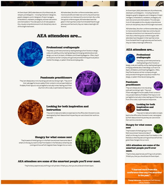
What interested me was the use of the circular images, which at one point we called “portholes,” but I came to think of as “bubbles.” As I prepared to implement the design in code, I thought back to the talk Jen Simmons has been giving throughout the year at An Event Apart. Specifically, I thought about CSS Shapes and how I might be able to use them to let text flow along the circles’ edges—something like Fig. 2.

This layout technique used to be sort of possible by using crude float hacks like Ragged Float and Sliced Sandbags, but now we have float shapes! We can define a circle—or even a polygon—that describes how text should flow past a floated element.
“Wait a minute,” you may be saying, “I haven’t heard about widespread support for Shapes!” Indeed, you have not. They’re currently supported only in the WebKit/Blink family—Chrome, Safari, and Opera. But that’s no problem: in other browsers, the text will flow past the boxy floats the same way it always has. The same way it does in the design comps, in fact.
The basic CSS looks something like this:
img.bubble.left {
    float: left; margin: 0 40px 0 0 ;
    shape-outside: circle(150px at 130px 130px);
    }
img.bubble.right {
    float: right; margin: 0 0 0 40px;
    shape-outside: circle(150px at 170px 130px);
    }
Each of those bubble images, by the way, is intrinsically 260px wide by 260px tall. In wide views like desktops, they’re left to that size; at smaller widths, they’re scaled to 30% of the viewport’s width.
Shape placement#section3
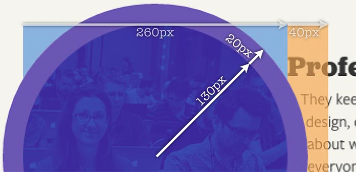
To understand the shape setup, look at the left-side bubbles. They’re 260×260, with an extra 40 pixels of right margin. That means the margin box (that is, the box described by the outer edge of the margins) is 300 pixels wide by 260 pixels tall, with the actual image filling the left side of that box.
This is why the circular shape is centered at the point 130px 130px—it’s the midpoint of the image in question. So the circle is now centered on the image, and has a radius of 150px. That means it extends 20 pixels beyond the visible outer edge of the circle, as shown here (Fig. 3).
In order to center the circles on the right-side bubbles, the center point has to be shifted to 170px 130px—traversing the 40-pixel left margin, and half the width of the image, to once again land on the center. The result is illustrated here, with annotations to show how each of the circles’ centerpoints are placed (Fig. 4).
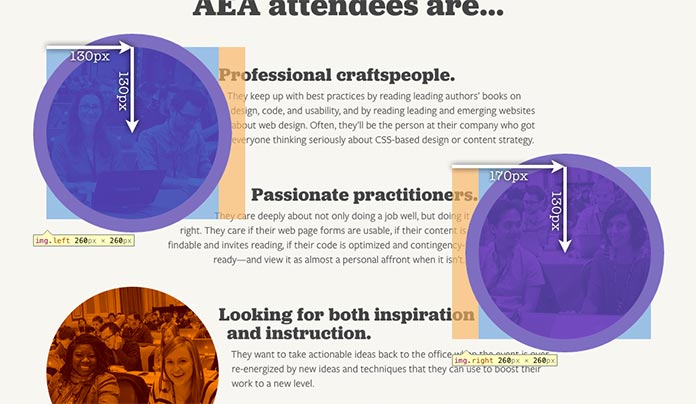
It’s worth examining that screenshot closely. For each image, the light blue box shows the element itself—the img element. The light orange is the basic margin area, 40 pixels wide in each case. The purple circle shows the shape-outside circle. Notice how the text flows into the orange area to come right up against the purple circle. That’s the effect of shape-outside. Areas of the margin outside that shape, and even areas of the element’s content outside the shape, are available for normal-flow content to flow into.
The other thing to notice is the purple circle extending outside the margin area. This is misleading: any shape defined by shape-outside is clipped at the edge of the element’s margin box. So if I were to increase the circle’s radius to, say, 400 pixels, it would cover half the page in Chrome’s inspector view, but the actual layout of text would be around the margin edges of the floated image—as if there were no shape at all. I’d really like to see Chrome show this by fading the parts of the shape that extend past the margin box. (Firefox and Edge should of course follow suit!)
Being responsive#section4
At this point, things seem great; the text flows past circular float shapes in Chrome/Safari/Opera, and past the standard boxy margin boxes in Firefox/Edge/etc. That’s fine as long as the page never gets so narrow as to let text wrap between bubbles—but, of course, it will, as we see in this screenshot (Fig. 5).

For the right-floating images, it’s not so bad—but for the left floaters, things aren’t as nice. This particular situation is passably tolerable, but in a situation where just one or two words wrap under the bubble, it will look awful.
An obvious first step is to set some margins on the paragraphs so that they don’t wrap under the accompanying bubbles. For example:
.complex-content div:nth-child(even):not(:last-child) p {
    margin-right: 20%;
}
.complex-content div:nth-child(odd):not(:last-child) p {
    margin-left: 20%;
}
The point here being, for all even-numbered child divs (that aren’t the last child) in a complex-content context, add a 20% right margin; for the odd-numbered divs, a similar left margin.
That’s pretty good in Chrome (Fig. 6) (with the circular float shapes) because the text wraps along the bubble and then pushes off at a sensible point. But in Firefox, which still has the boxy floats, it creates a displeasing stairstep effect (Fig. 7).


On the flip side, increasing the margin to the point that the text all lines up in Firefox (33% margins) would mean that the float shape in Chrome would be mostly pointless, since the text would never flow down along the bottom half of the circles.
Querying feature support#section5
This is where @supports came into play. By using @supports to run a feature query, I could set the margins for all browsers to the 33% needed when shapes aren’t supported, and then reduce it for browsers that do understand shapes. It goes something like this:
.complex-content div:nth-child(even):not(:last-child) p {
    margin-right: 33%;
}
.complex-content div:nth-child(odd):not(:last-child) p {
    margin-left: 33%;
}

@supports (shape-outside: circle()) {
    .complex-content div:nth-child(even):not(:last-child) p {
        margin-right: 20%;
    }
    .complex-content div:nth-child(odd):not(:last-child) p {
        margin-left: 20%;
    }
}
With that, everything is fine in the two worlds (Fig. 8 and Fig. 9). There are still a few things that could be tweaked, but overall, the effect is pleasing in browsers that support float shapes, and also those that don’t. The two experiences are shown in the following videos. (They don’t autoplay, so click at your leisure.)


Thanks to feature queries, as browsers like Firefox and MS Edge add support for float shapes, they’ll seamlessly get the experience that currently belongs only to Chrome and its bretheren. There’s no browser detection to adjust later, no hacks to clear out. There’s only silent progressive enhancement baked right into the CSS itself. It’s pretty much “style and forget.”
While an arguably minor enhancement, I really enjoyed the process of working with shapes and making them progressively and responsively enhanced. It’s a nice little illustration of how we can use advanced features of CSS right now, without the usual wait for widespread support. This is a general pattern that will see a lot more use as we start to make use of shapes, flexbox, grid, and more cutting-edge layout tools, and I’m glad to be able to offer this case study.
Further reading#section6
If you’d like to know more about float shapes and feature queries, I can do little better than to recommend the following articles.
- CSS Shapes 101 by Sara Soueidan
- Using Feature Queries in CSS by Jen Simmons


I’m not seeing the effect on Safari (macOS 10.12 Sierra), though it should be supported. Not using prefixes?
Same for older versions of Safari. Brad’s right, need some prefixes.
Hey, Brad and Daryll. Yep, you’re right: I left off the prefix detection and prefixed properties, mostly because prefixes are supposed to be over now. I mean, you’d think the Safari team could have dropped the prefix requirement for this by now. But I probably should have gone that extra step, so we’ll be adding the prefixed stuff to the site. Thanks for the prod!
Question regarding this line of code
shape-outside: circle(150px at 170px 130px);
Is the (at) being used to center the circle?
Thanks!
On my windows 10 PC, on firefox and edge it’s not working. On Opera and Chrome it is.
BRSizemore: yes, that’s correct. The syntax is defined at https://www.w3.org/TR/css-shapes-1/#funcdef-circle, next to all the other options. Polygons are particularly fun! (And even more fun, which I didn’t cover in the piece for various reasons, you can use alpha-channel levels with
shape-image-threshold: https://www.w3.org/TR/css-shapes-1/#propdef-shape-image-threshold.)Sunipeyk: As it says in the article:
(See previous comments for notes about
-webkit-prefixing for Safari.)Didn’t know you could do this with CSS only. Thanks for sharing!
All that and you forget retina support!?!
yes ivan wong is correct and thanks for this post.
Thanks for sharing this, creating styling bubbles with just css!! its awesome, a worthy content to share with friends.
Web development company in Trivandrum Kerala India
Awesome case study. Cant wait until it’s supported widely.
Thanks Eric for this article – but I have been doing the portholes or the bubbles using a border-radius and i used to give it 50% – i get rounded images using that approach – is that any different from the shape-outside outcome? does it have any drawbacks?
I love using css3 for shapes in my website designs. I have recently been experimenting with section dividers using css and background image property. Looks great, my problem is I now need to adjust code for all screen sizes as it doesn’t sit right. Great article.